Week 1: Intro to Interaction Design

Analysis, Interaction Design, Lecture Review

Interaction is the direct involvement with something. Interaction design relates to the aspects of the interface that the user clicks on or receives feedback from in some way (think: a button that leads them to another page is an interaction). When done properly, interaction design lifts the users experience. By providing instant feedback, through links, buttons and animation, the user is drawn to the site and more likely to stay longer. Interactions need to be thoroughly thought out and planned. Unnecessary interactions can be distracting or confusing. Interaction designers need to consider who they are designing for, their context and prior knowledge.

Designer, Bill Verplank believes the 3 questions to ask are:

how do you do? (act)
(the client does something and we provide the tools)

how do you feel? (think)
(we provide the platform that we think is best suited – control the machine to give them feedback)

how do you know?
(what kind of knowledge do we expect of our users – how can we best guide them)

Sharp, Rogers and Preece, (2002) Interaction Design, John Wiley & Sons, Inc. New York, NY, USA.

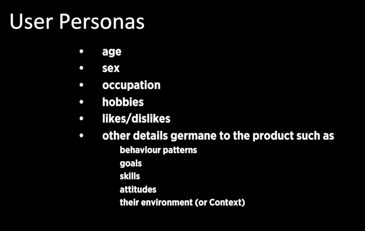
Interactivity is something that responds to an action. Types of common interactivity include: phones, websites, conversations and the 5 senses (things we can see, touch, smell, taste, hear). Interactions can be small and almost unrecognisable or explicit. It is most important to understand who you are designing for, once you understand the user, a designer can better plan and create accordingly.

Waterson, S. (2019). GDIDMPOD01a [Online Lecture]. Retrieved from  https://vimeo.com/319375480

Week 7: UI Visual Design Patterns

Analysis, Instructional Design, Lecture Review

User Interface (UI) is often mistaken for the visual design appearance of a site. In reality the UI is the presentation, format and layout of the tools and information – it is the structure or bones of a site. Designers need to consider how the user will interact with the site and design according to those needs. UI needs to be familiar to an extent, if the interface is new and unusual the user may get confused, lose interest and leave the site. It should require effortless navigation and interactivity by the user, which has been carefully planned mapped.

The User Interface (UI) should heighten the User Experience (UX)

Tabs

  • Come from the real world
  • Skeuomorphism
  • When: content needs to be separated into sections
  • When there is 2-9 sections of flat navigation mode
  • Section names are short
  • Entire width of the page

Drop Down

  • Space is limited
  • Not regarded as a technique that increases usability – can be difficult to use
  • Save space
  • 2-9 sections of content
  • functionality resembles a desktop navigation
  • don’t use when you need to single out the section of the site – use tabs
  • fly out from the side (hamburger)
  • quick access

Search bar with dropdown

  • quick
  • hierarchy can get in the way of the user’s intentions
  • short cut

Big footer

  • by pass the top nav
  • specific page of functions that are more frequently used
  • short cuts!
  • Sign of poor nav

Home

  • ‘go back to a safe place’
  • the logo is usually linked
  • safe
  • always need one
  • should always be in the same location on all pages! – don’t move the home button

Breadcrumbs

  • needs to know their location
  • minimal space
  • hint to the structure of the website
  • current locations place in the hierarchy of the website
  • strict structured websites
  • lots of sections that are divided
  • DETAIL
  • Together with other navs
  • Don’t use it alone

Content nav patterns:

Carousel

  • Browse through a set of options
  • Tease the user – there is more than you think
  • Space saving
  • Need to indicate where you are – how many cards

Tags

  • Categories
  • Etc.

Waterson, S. (2019). GDIDMPOD07a [Online Lecture]. Retrieved from https://vimeo.com/319376545

Week 6: User Scenarios

Analysis, Interaction Design, Lecture Review

After successfully creating user personas, the next step in the design process is developing user scenarios. These scenarios depict how the intended user will interact with the product or site. If done properly it should identify points that stand out to the user, what things they would look for, and should identify problems and solutions before a final product is released. The process includes mapping out the direct path the user would take when using your product. This process should be done multiple times and should question every decision and aspect of the product.

Scenarios are effective in highlighting hierarchy and points of interest in the site. They give designers an idea of what the user would expect to see at certain times throughout their process. Designers should also consider the context in which the user will be interacting with the product. This process is important to solve potential problems as well as attempting to view the product through objective eyes. When a designer is creating, it can be difficult to isolate themselves from the product they are immersed in. A user scenario helps to unveil this objective experience.

Waterson, S. (2019). GDIDMPOD06a [Online Lecture]. Retrieved from https://vimeo.com/319376412

Week 5: Personas

Analysis, Lecture Review

User Personas

User personas are fictional characters that reflect real users. They are not an exaggeration but a true representation of hypothesised group. When creating personas, it is important to use informed research or knowledge of the intended user base. They should specify goals, behaviours, skills, environmental factors, attitudes, likes and dislikes. During this process the expectations of the users should be outlined as well.

The most important thing to consider when creating a persona is to be true to the task. If you have created an exaggerated persona who fits the criteria perfectly you will not get effective or informative feedback. Designers must consider all aspects of the targeted audience and aim to create solutions to best suit these needs, however, understand that the perfect client or user does not generally exist in the real world.

Artefact Personas

Artefact personas are a direct representation of the project. They help to create an identity and ‘keep things objective’. Consider questions like:

  • If the interface was a person, what would he or she be like?
  • How would you expect users to react when they first view the product?
  • How would you describe this product to a friend?
  • How is the product different from competitive products?
  • Which celebrity is the product most like? / Least like? Why?

Waterson, S. (2019). GDIDMPOD05a [Online Lecture]. Retrieved from https://vimeo.com/319376412

Week 3: Design Patterns

Analysis, Interaction Design, Lecture Review

Design patterns are a starting point for all user interaction planning. As Christopher Alexander, author of ‘A Pattern Language’ mentions, “patterns are hypotheses… free to evolve under the impact of new experiences and observation”. This implies that any design patterns must be altered to suit the aims of the project and the needs of the user. They provide a basic platform for which the designer is responsible to build upon. A new movement, mobile first, suggests that designing for a smaller device first means the adaption to a larger desktop would be easier. The lecture continues to review the most popular design patterns for desktop screens, which are as follows:

UI Pattern Proliferation

  • A lot of a sites are very similar in user interface design patterns
  • There’s no point in reinventing something that doesn’t need to change

Hamburger

  • The 3 bar menu      
    • Top left or right
    • A drop down
    • Saves space on screen – especially on smaller screens
    • Main content in hidden

Hamburger Menu Icon [Image] Retrieved 2019, May 15 from https://uxplanet.org/the-ultimate-guide-to-the-hamburger-menu-and-its-alternatives-e2da8dc7f1db

Account Registration

  • Form to fill out or a button to use a social account to sign up
  • Encourage users to complete one step at a time not a huge form on one page
  • Typeform.com

Long Scroll

  • Think Facebook/Instagram
  • Storytelling
  • Can still access multi page sites

Card Layouts

  • Pioneered by Pinterest
  • Each card represents each different section of content
  • A card can be any size – will have a title, username, picture,
    • Condensed webpage

Hero Images

  • The increased internet speeds allow for large images to load faster
  • Above the scroll followed by a card layout section

National Geographic. (2019). Documentary Agency. Retrieved from https://www.nationalgeographic.com/

Animation

  • Must be added strategically
  • Can really enhance the user experience
  • Small scale – spinners, loading bars,

Loading animations

  • Popular for flat or minimal or portfolio design
  • Should not use sound

Loading Animation [Image] Retrieved 2019, May 15 from https://codemyui.com/git-kraken-inspired-rotate-loading-animation/

Navigation and menus (non scrolling animations)

  • Space saver

Hover animations

  • Instant visual feedback
  • Don’t work for mobile obviously

Gallery and slideshow animations

Motion animation

  • Visual hierarchy

Scrolling and background animation

  • Should be used in moderation

Material Design

  • Appears more realistic
  • Shadows, minimalistic look
  • Popular
  • Creates depth
  • Flat design – apple IOS
  • Popular for app design

Responsive Design

  • Works well with cards

Flat Design

  • Compatible with other design patterns

Alexander, C. (1977). A pattern language. Oxford, England: Oxford University Press.
Waterson, S. (2019). GDIDMPOD03a [Online Lecture]. Retrieved from  https://vimeo.com/319375751