Week 7: UI Visual Design Patterns

Analysis, Instructional Design, Lecture Review

User Interface (UI) is often mistaken for the visual design appearance of a site. In reality the UI is the presentation, format and layout of the tools and information – it is the structure or bones of a site. Designers need to consider how the user will interact with the site and design according to those needs. UI needs to be familiar to an extent, if the interface is new and unusual the user may get confused, lose interest and leave the site. It should require effortless navigation and interactivity by the user, which has been carefully planned mapped.

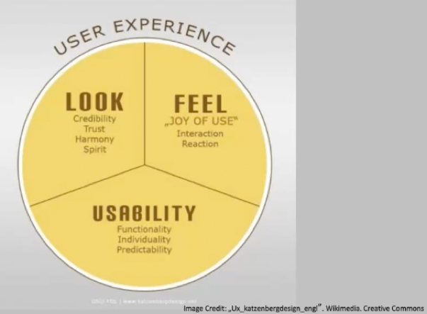
The User Interface (UI) should heighten the User Experience (UX)

Tabs

  • Come from the real world
  • Skeuomorphism
  • When: content needs to be separated into sections
  • When there is 2-9 sections of flat navigation mode
  • Section names are short
  • Entire width of the page

Drop Down

  • Space is limited
  • Not regarded as a technique that increases usability – can be difficult to use
  • Save space
  • 2-9 sections of content
  • functionality resembles a desktop navigation
  • don’t use when you need to single out the section of the site – use tabs
  • fly out from the side (hamburger)
  • quick access

Search bar with dropdown

  • quick
  • hierarchy can get in the way of the user’s intentions
  • short cut

Big footer

  • by pass the top nav
  • specific page of functions that are more frequently used
  • short cuts!
  • Sign of poor nav

Home

  • ‘go back to a safe place’
  • the logo is usually linked
  • safe
  • always need one
  • should always be in the same location on all pages! – don’t move the home button

Breadcrumbs

  • needs to know their location
  • minimal space
  • hint to the structure of the website
  • current locations place in the hierarchy of the website
  • strict structured websites
  • lots of sections that are divided
  • DETAIL
  • Together with other navs
  • Don’t use it alone

Content nav patterns:

Carousel

  • Browse through a set of options
  • Tease the user – there is more than you think
  • Space saving
  • Need to indicate where you are – how many cards

Tags

  • Categories
  • Etc.

Waterson, S. (2019). GDIDMPOD07a [Online Lecture]. Retrieved from https://vimeo.com/319376545

Week 3: Design Patterns

Analysis, Interaction Design, Lecture Review

Design patterns are a starting point for all user interaction planning. As Christopher Alexander, author of ‘A Pattern Language’ mentions, “patterns are hypotheses… free to evolve under the impact of new experiences and observation”. This implies that any design patterns must be altered to suit the aims of the project and the needs of the user. They provide a basic platform for which the designer is responsible to build upon. A new movement, mobile first, suggests that designing for a smaller device first means the adaption to a larger desktop would be easier. The lecture continues to review the most popular design patterns for desktop screens, which are as follows:

UI Pattern Proliferation

  • A lot of a sites are very similar in user interface design patterns
  • There’s no point in reinventing something that doesn’t need to change

Hamburger

  • The 3 bar menu      
    • Top left or right
    • A drop down
    • Saves space on screen – especially on smaller screens
    • Main content in hidden

Hamburger Menu Icon [Image] Retrieved 2019, May 15 from https://uxplanet.org/the-ultimate-guide-to-the-hamburger-menu-and-its-alternatives-e2da8dc7f1db

Account Registration

  • Form to fill out or a button to use a social account to sign up
  • Encourage users to complete one step at a time not a huge form on one page
  • Typeform.com

Long Scroll

  • Think Facebook/Instagram
  • Storytelling
  • Can still access multi page sites

Card Layouts

  • Pioneered by Pinterest
  • Each card represents each different section of content
  • A card can be any size – will have a title, username, picture,
    • Condensed webpage

Hero Images

  • The increased internet speeds allow for large images to load faster
  • Above the scroll followed by a card layout section

National Geographic. (2019). Documentary Agency. Retrieved from https://www.nationalgeographic.com/

Animation

  • Must be added strategically
  • Can really enhance the user experience
  • Small scale – spinners, loading bars,

Loading animations

  • Popular for flat or minimal or portfolio design
  • Should not use sound

Loading Animation [Image] Retrieved 2019, May 15 from https://codemyui.com/git-kraken-inspired-rotate-loading-animation/

Navigation and menus (non scrolling animations)

  • Space saver

Hover animations

  • Instant visual feedback
  • Don’t work for mobile obviously

Gallery and slideshow animations

Motion animation

  • Visual hierarchy

Scrolling and background animation

  • Should be used in moderation

Material Design

  • Appears more realistic
  • Shadows, minimalistic look
  • Popular
  • Creates depth
  • Flat design – apple IOS
  • Popular for app design

Responsive Design

  • Works well with cards

Flat Design

  • Compatible with other design patterns

Alexander, C. (1977). A pattern language. Oxford, England: Oxford University Press.
Waterson, S. (2019). GDIDMPOD03a [Online Lecture]. Retrieved from  https://vimeo.com/319375751