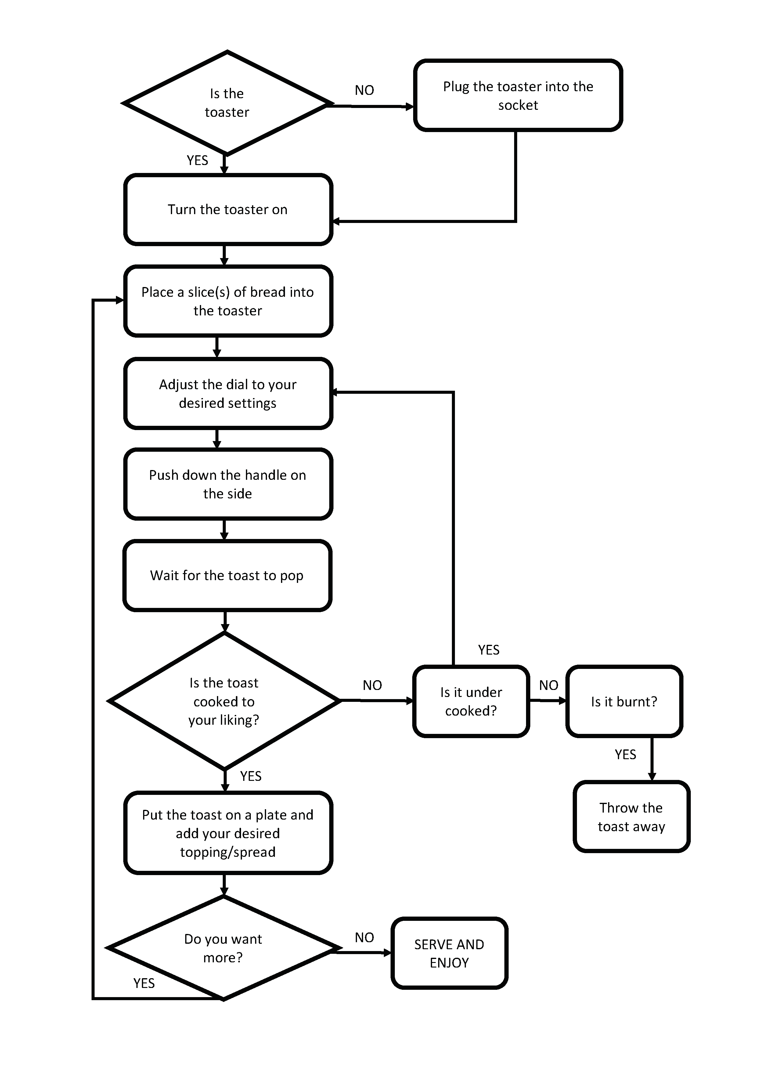
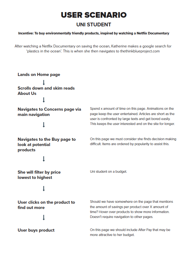
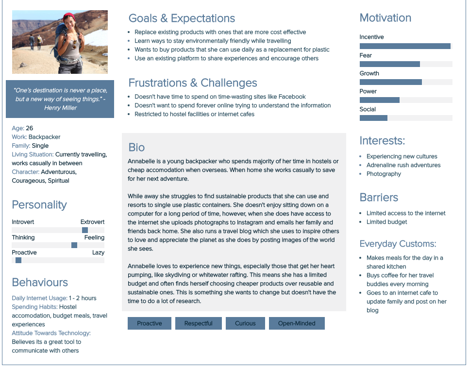
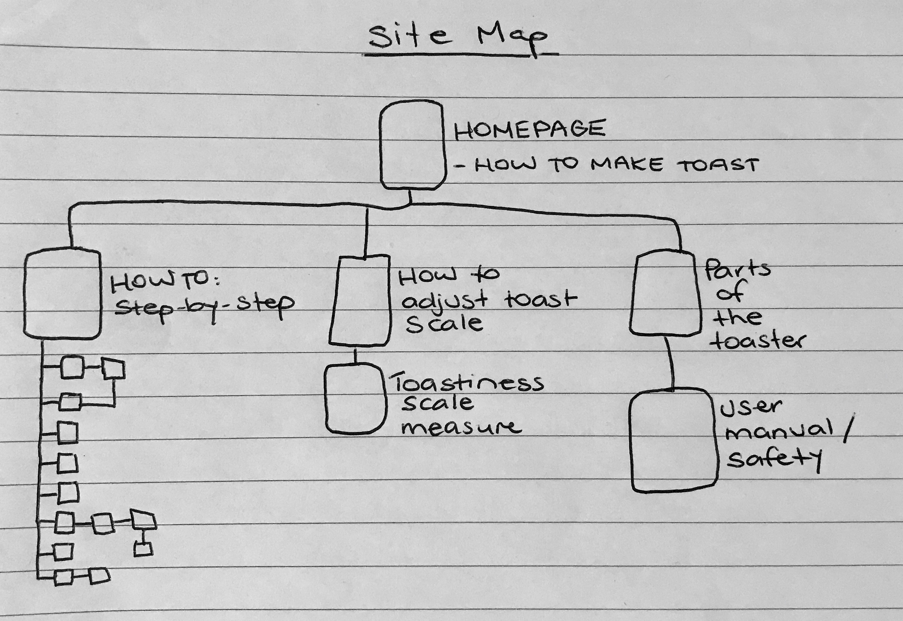
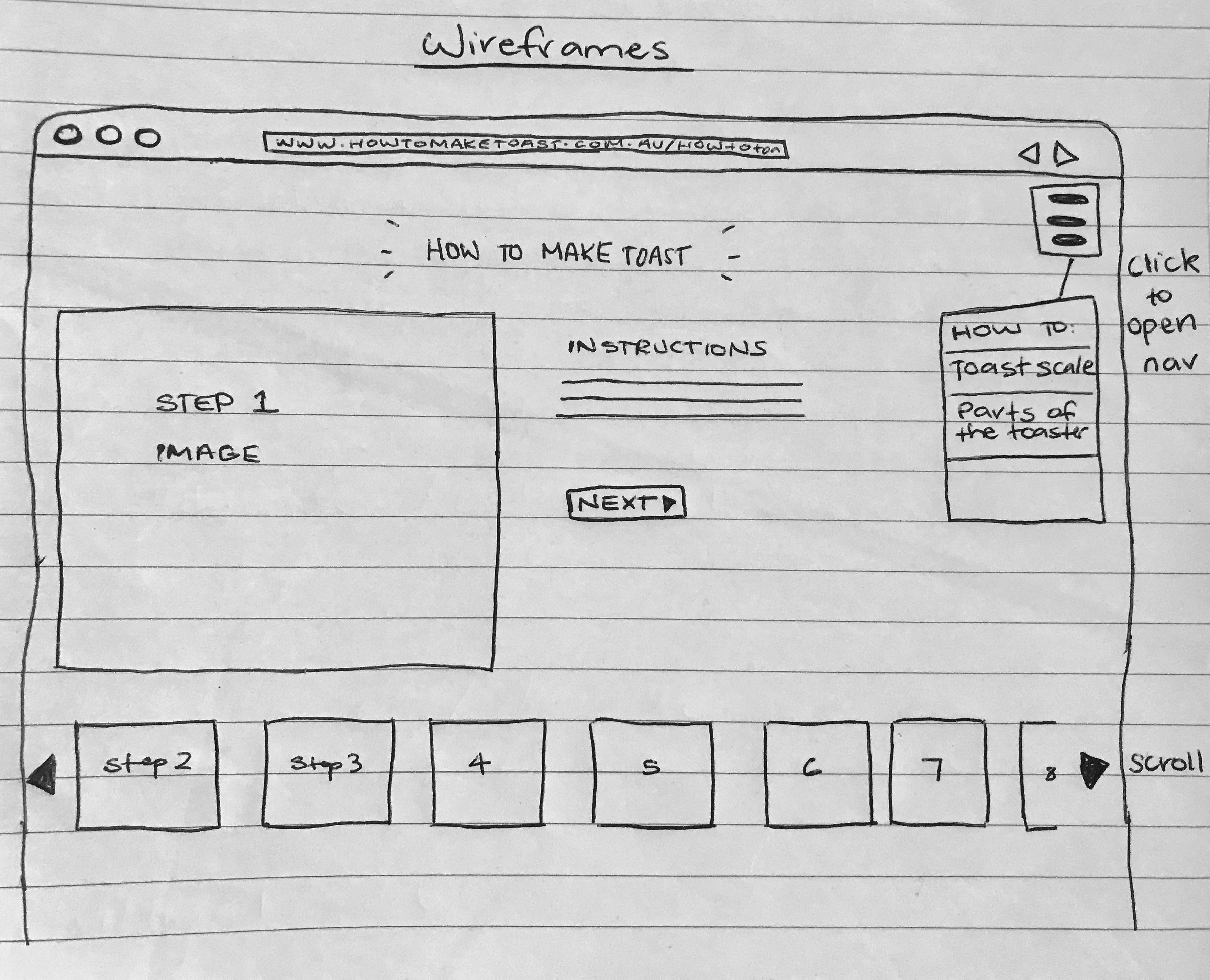
Wireframe

Interface Design 1

Interface Design 2
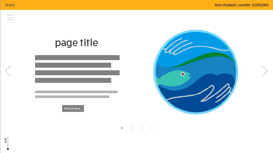
Interface Design 3


Below is the result of a collaborative analysis of the website ‘Beat Plastic Pollution’, which aimed to promote World Environment Day.
Group Members: Elyse Potter, Tracey Phan and Tara Pravica
It is about bringing the awareness that usage of plastics use materials are causing our planet to be in risk.
This site is designed on educating high school students and adults about the basic negative impact of plastic pollution it has on the world.
The interactive site assumes that the user knows how to access the internet whether it’s using the computer, mobile, etc. It also assumes they know how to scroll and read through the website as well as clicking the buttons at the top of the page for language options.
The video at the end doesn’t work on my browser. There’s no audio or play/pause function. The user interface of this site has limited interaction as there is no title and menu bars to guide the users to seek the content and to reach their goals. It is very difficult to differentiate where would the users seeks the content and complete their goals due to zero interactivity. However, the interactivity map of the world through halfway scrolling clearly visualizes how much each country wastes plastics per day and the use of colours are useful to further explain it.
Colour: The colour blue on the site doesn’t present well on screen. It’s too bright, which can be a little overwhelming, particularly when you scroll down to the stacks of plastic. Variations of colour in the graphics would also help distinguish the different images.
Typography: At the top part of the site (with the scroll interactive) the waterfall-like graphics distract from the text. Again, colour is an issue here. Lacks readability where the graphics fall behind the text. The choice of san serif typeface is very readable and appropriate to the audience but again, the movement of graphic images ruined the user’s focus on the important content of the plastic pollution timeline.
Layout: I do like the single column layout, however there is no structure to the information which makes this feature extremely frustrating – not user friendly
It’s an informational website to help educate on plastic pollution to students and adults, with scrolling being its main function. This website uses a long scroll effect to represent their information, timeline, images and video through a single straight down motion, taking the user onto a journey. Animation of plastic is also used in the background of different sections of the site (falling down and moving left to right).
Beat Plastic Pollution. (n.d.). Retrieved from https://www.unenvironment.org/interactive/beat-plastic-pollution/?fbclid=IwAR3mevwwWLSjeps7Pmjpz3_7tyg-KRnQmtOaSyKvvDqExgv09BWtHTor2J0


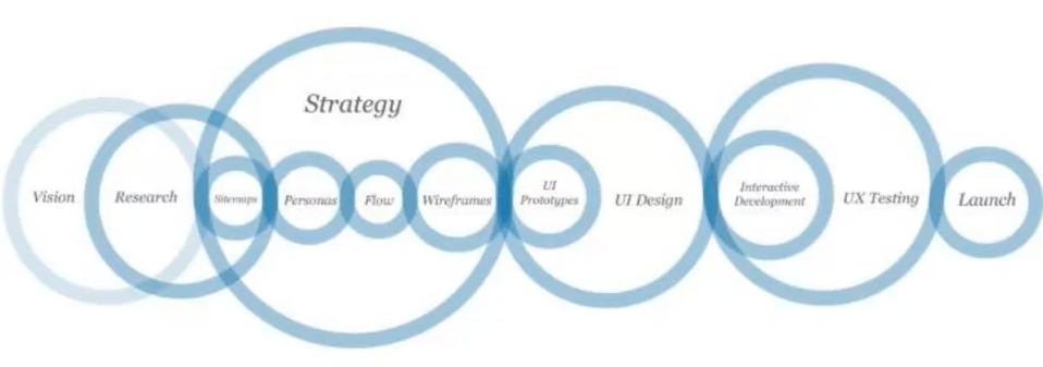
Designers must first consider the complexity and dynamic culture of contemporary society when planning for any widely-used interactive media. Precedent research is done in the preliminary stages of the design process, beginning with brainstorms and note taking based on quantitative and qualitative research, content analysis and observation. The designer makes informed decisions based off the findings to narrow down the research into flowcharts, storyboards and sitemaps to clearly communicate how the user will interact with the interface. If done effectively, the designer will often spend most of their time working through a process and refining design features and concepts, before creating the final product. However, in order to perfect this, the designer must consider, not only how the user thinks and their influences, but also in what context they will use the product.
Depending on the clients aims and intended purposes, designers must contemplate their knowledge of the audience as well as potential problems that may occur when using the product. Key points the designer needs to consider include:
Once these have been researched and answered the designer can effectively create a product, that suits both the needs and aims of the client, as well as successfully connecting the user and the information in a clear and efficient manner.
Waterson, S. (2019). GDIDMPOD02a [Online Lecture]. Retrieved from https://vimeo.com/319375610
Interactivity, more specifically interactive design, takes on many forms and relates to any ways in which humans respond to any type of media that require a response or action. This can be as simple as a conversation between two people or the use of a responsive app or website that demands the users input in order to work effectively. Bill Verplank, describes role of interaction design as ‘design for people who act on the world around them and receive feedback’. He considers the role of an interaction designer is to ask 3 questions, how do we act, how do we think or feel and how do we know. Similarly, Gillian Crampton Smith, believes that the designer must first know their audience to design accordingly for their needs. The designer must think for the user and plan interactions based off how the information will be received most effectively. Thus, it is vital for a designer to know how a range of people behave and what preconceived ideas they already have to be able to provide the tools they need and design a platform that connects the user and the information successfully.
Waterson, S. (2019). GDIDMPOD01a [Online Lecture]. Retrieved from https://vimeo.com/319375480reference:
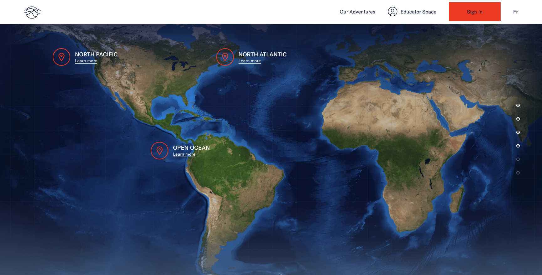
All 3 of these sites utilise a long scroll feature and animation. They require the user to scroll to reveal new information and click on targeted points on the screen. The animations invite the user to expect more as they navigate through the site. These types of interaction are simple and short but capture the users attention. Each use a progress bar on the right hand side of the interface which implies the user would expect to see this here. These user interfaces are a perfect examples of successful interaction design.